Like Insomniac’s original Marvel’s Spider-Man, the studio’s new sequel, Marvel’s Spider-Man 2, looks really good. It’s one of those games that just about anyone will look at and go “Wow, what a great-looking game!” But if you dig a bit deeper and compare the original 2018 Spider-Man and its 2023 PS5-exclusive sequel, you’ll discover an interesting mix of improvements and compromises.
In case you’ve been living under a rock, Spider-Man 2 (out on October 20) is the bigger, better follow-up to the critically acclaimed 2018 game and 2020’s Marvel’s Spider-Man: Miles Morales. In his review, Kotaku’s Ethan Gach said that the latest Spider-Man sequel is as good as the previous games, adding that in many ways it’s “even better.” And I’m inclined to agree after playing Spider-Man 2 for the past two weeks. The sequel is likewise visually impressive, and at first glance seems to be a complete improvement over the prior two. But in reality...well okay, yeah, it’s mostly an improvement. Yet when you directly compare old and new you can spot some cutbacks and tweaks Insomniac presumably made to ensure the sequel’s performance is silky smooth.
Thanks to a fantastic direct comparison video from Youtuber Nick930, we can see just how Spider-Man 2 improves on the already-impressive graphics of the first game.
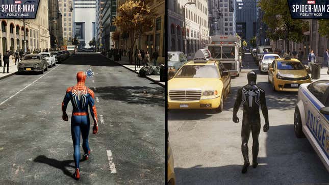
For example, the sequel sees a huge increase in traffic density. Comparing the new game with 2018’s, it’s almost laughable how few cars can be spotted in the original. NYC looks like a ghost town.

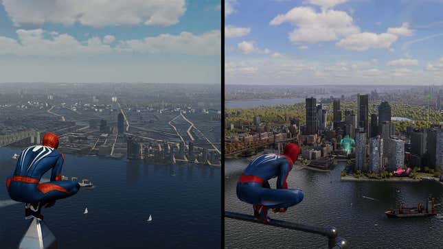
Main character models and textures also see a nice bump in quality, and improved ray-traced reflections can be found throughout New York. Something I noticed when playing Spider-Man 2 is how buildings now reflect other buildings, which helps the city look more real and less like a movie set or video game world. The rivers in NYC have also been improved, with better reflections and more lifelike physics when objects like boats are seen interacting with the water.
Smart cutbacks and compromises
But on the flip side, the number of people you’ll see milling about in the city that never sleeps has been reduced, with some areas of the game being more devoid of pedestrians than I expected. As suggested by Nick930, this change was likely made as a result of Insomniac adding more variety to crowds, and for the most part, I never noticed this when playing.

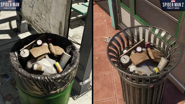
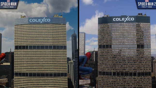
Another example of some cutbacks is that very small details—soda cans in trash bins, newspapers lying on rooftops—aren’t as nice looking up close as they were in the original game. Similarly, the level of detail of the city seems reduced. So when you climb up a skyscraper and look out you’ll notice, on close inspection, objects like distant radio towers, AC units, or trees are missing or much lower quality than in Spider-Man 2018.
These changes were likely a result of the game increasing its map size to include Brooklyn and Queens, nearly doubling the playable space. At some point, to keep performance from dipping, it’s likely that things most players barely notice were tweaked so resources could be spent elsewhere.
These tweaks are a good thing
Overall, the main takeaway shouldn’t be that Spider-Man 2 is a visually inferior game to the first entry. In fact, most of the cutbacks and compromises spotted in the video were tweaks or changes I didn’t notice in my 30 or so hours playing the game on a fancy 4K 120Hz TV. Instead, it seems Insomniac went through Spider-Man 2 with a fine-tooth comb and subtle hand, trying to balance impressive visuals and responsive, consistent performance. I personally didn’t notice a single dropped frame.

In an era when it seems like every other big game released these days is launching in a dismal state, with numerous performance issues or game-breaking bugs, it’s nice to see a studio taking the time and effort to ensure its game arrives in a rock-solid state. I mean, one look at how snappy fast travel is in this game, and I’m sold on whatever minor, hard-to-spot tweaks had to be made to get this thing running so well.
Maybe some of these changes mean cups and soda cans in Spider-Man 2’s trash bags don’t look as good as before. But if the tradeoff is I get a 60fps open-world Spider-Man game featuring two playable characters and hours of side content and RT reflections everywhere, I’ll live!
.
"original" - Google News
October 20, 2023 at 05:01AM
https://ift.tt/nLIpXlZ
Spider-Man 2's Graphics Are (Mostly) Improved Over Original's - Kotaku
"original" - Google News
https://ift.tt/fKT9SE1
https://ift.tt/Qkr40IC
Bagikan Berita Ini


0 Response to "Spider-Man 2's Graphics Are (Mostly) Improved Over Original's - Kotaku"
Post a Comment